Accessibility
This file contains a description of how we test the accessibility in pm-netbank. You can read about why acccessibility is important at uutilsynet and at Eufemia
Table of contents
About Accessibility
A lot of accessibility functionality is handled by Eufemia and the designers, so we don't need to think about colour contrast, font readability, scaling, icons, and alt texts.
It's still not a bad idea to know how to test these things. In Resources you can find some tools you can use, as well as uutilsynets own documentation
HTML element hierarchy
One of the first things we can do to ensure the application is accessible is to make sure we use the HTML tags correctly.
Correct Heading
Read about how to style with correct headings in Eufemia
All your H- tags should be in the correct hierarchy. So no H3 if there are no H2 on the page. When using a screen reader the Heading tags are used to look through the page and should be used in a way so that you can get an overview of the page content looking only at the headings.
Things worth noting here is that when you use the SimpleHeader (from PageLayout in /libs/pm-netbank/page-layout) you will always get the H1 tag, so no need to add this.
Hidden Heading
Another useful trick is that in cases where the designs are more complicated and to a higher degree rely on visuals to separate the page rather than headers, we can help screen readers by adding hidden elements visible only to the screen reader. To do this we can use the VisuallyHidden Eufemia component.
<VisuallyHidden>This is visible only to the screen reader</VisuallyHidden>
Another way of doing this is by adding the class dnb-sr-only
<H2 className="dnb-sr-only">Only visible to screen readers</H2>
Note that if you add any screen reader only functionality it's important that you test this with a screen reader, just like you would test it in a browser normaly.
Correct List hierarchy
In the same way we use the H-tags, we should also use the list elements.
- Ul -> List
- Li -> List item
Or for description lists
- Dl -> List
- Dt -> Description
- Dd -> Content
Manual Testing Accessibility
After developing a page you need to test the accessibility the same way you test the functionality.
I. Keyboard Navigation
Everything you are able to do using mouse and keyboard you should be able to do using only keyboard.
You can navigate using the Tab ( ↹ ) button, back using Shift+Tab ( ⇧ ↹ ) and click enter ( ↵ ) to select.
Make sure all buttons, dropdown menus, and text fields are accessible through keyboard navigation, just like you do when testing with a mouse.
Keyboard Navigation Fixes
Navigating using the keyboard should be smooth for us when we use Eufemia. If there are issues however, Eufemia provides tools we can use to customize the focus of the page.
It's worth noting that when navigating using the keyboard the navigation always follows the top to bottom in the HTML file. So if Button1 is placed above Button2 in the code we will reach Button1 first. If we want Button2 to appear first we just need to place it above Button1 in our code.
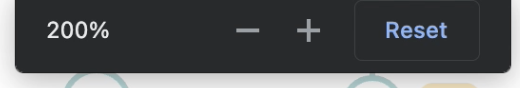
II. 200% zoom
Zoom in using CMD + (⌘ +) until you reach 200% zoom. Make sure everything is still accessible and makes sense.
III. Screenreaders
How to enable screen reader on mac
Navigate through the page using the screen reader. You should be able to access all text and functionality without looking at the screen at all. You can try to turn off your screen, or put on a blindfold to see if the content is represented clearly or not.
The images in pm-netbank/components/src/lib/images should all have alt text in lokalise. When testing with the screen reader make sure that this text makes sense compared to the image. The alt text should follow the same pattern as the other images, Ask the copywriter if not sure. Note that illustrations for purely stylistic purposes, such as lines dividing content, should not have an alt text.
It's also worth noting that screen readers work differently on Windows, Mac and on phones.
Screen Reader Fixes
Elements should let the user know what they contain. Traditionally we have headers to separate content into chunks, but not in all cases.
Its also usefull to know that the screen reader goes through the page from top to bottom in the html code. So if you want element A to be read before element B you can place it over inside the code and move it to the correct position using css:
// Before
/* Screen reader reads B before A */
<B />
<A />


// After
/* Screen reader reads A before B */
<span className="wrapper">
 <A />
 <B />
</span>

/*
// css
.wrapper{
  display: flex;
  flex-direction: row-reverse
}
*/
For illustrations, figures and graphs use aria- tags, this is supported and explained how in Eufemia
Resources
Reading
Tools
- Storybook has a plugin a11y that can help us in spoting accessibility errors, and warnings.
- Chrome extension: Headings mapper chrome extension
- Chrome extension: Web disability simulator
- Colour contrast checker